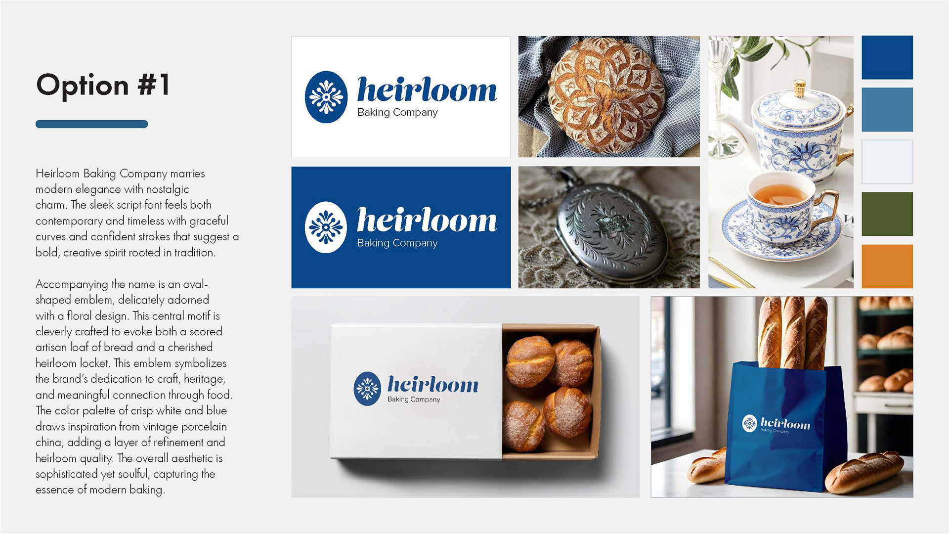
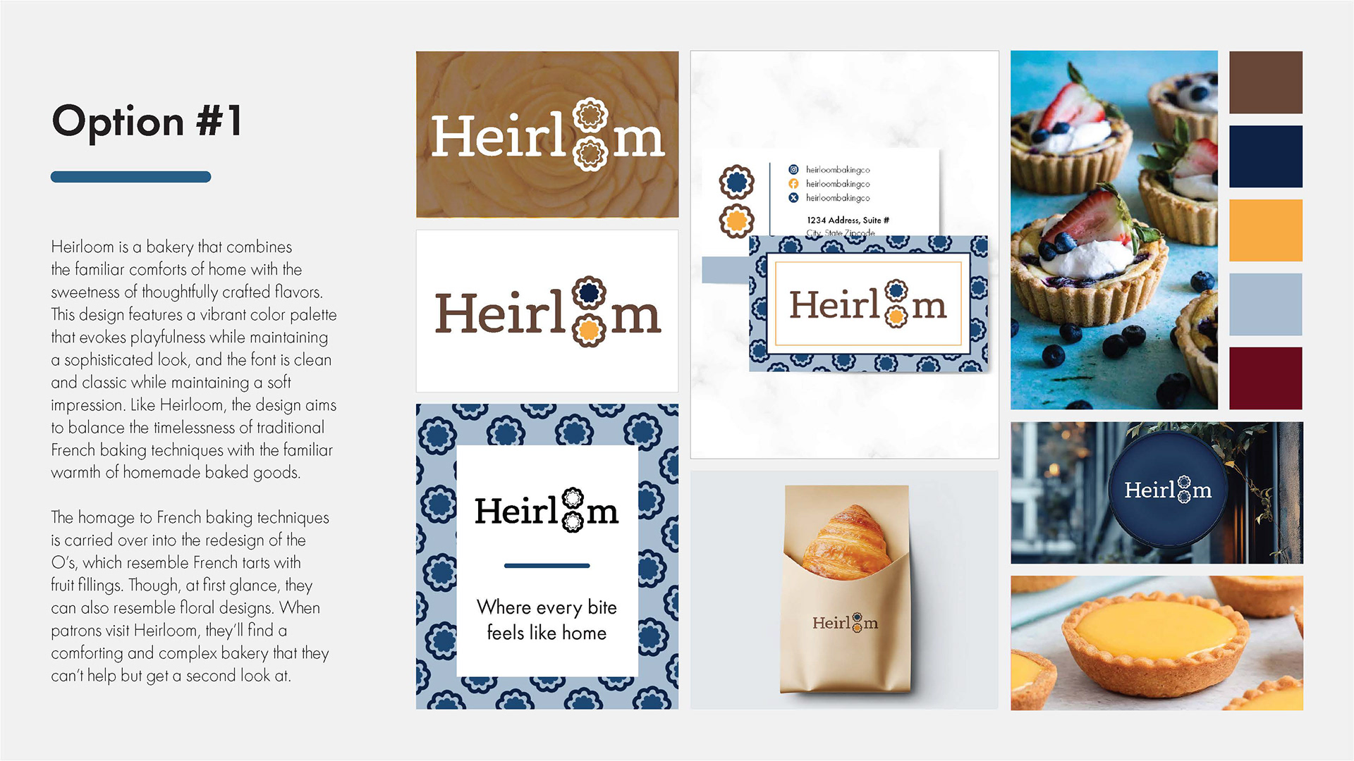
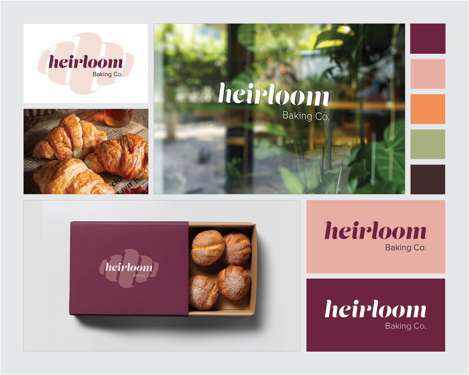
Heirloom Baking Co. stands out among other bakeries as a place where traditional ideas are brought into a modern context. This design features a stylish calligraphic font that, although based in tradition, breaks conventions to be playful, contemporary, and just a little sexy. The “L” from the font is echoed and repeated in the design to resemble familiar baked goods, namely croissants and loaves of bread.
The comforting tones of pink and maroon are the foundations of a palette that evokes a warm welcome. Heirloom Baking Co. will catch patrons’ eyes with its chic and alluring appearance, and they’ll keep coming back for the delicious treats and friendly community that they find inside.
Other brand identity solutions presented below. The client and I did two rounds of logo options. When the client and I first started working together, she knew her mission but felt unsure about her aesthetic. We took her dream of making this bakery a safe space and heirloom for her community and attempted several different tones and styles to match her mission.